Small Living Room Color Ideas: Make Rooms Look Bigger
Choosing the right color for a small living room can feel like a high-stakes guessing game — pick the wrong shade and your space suddenly feels like a shoebox. But here’s the good news: there’s actual science behind which small living room color ideas work, and once you understand the logic, making the right call gets a whole lot easier.
Key Takeaways
- Light, cool-toned colors reflect more light and visually expand a small living room — but they’re not your only option.
- Dark, moody palettes can actually make a small room feel more intentional and intimate when used correctly.
- Monochromatic color schemes (walls, trim, and ceiling in the same or similar hue) are one of the most effective tricks for eliminating visual boundaries.
- Undertones matter more than the color itself — a “white” with pink undertones behaves very differently than one with gray undertones.
- Paint sheen, natural light levels, and furniture scale all dramatically affect how a color reads in your specific room.
The Science Behind Color and Space Perception
Color doesn’t just affect our mood — it literally changes how our eyes perceive distance and volume. Light wavelengths from warm or pale colors reflect off walls and bounce around a room, creating an illusion of more space. Darker shades absorb light, which reduces the visual contrast between surfaces and can either shrink a space or, counterintuitively, make it feel like it was designed that way on purpose.
According to research on color perception in environmental psychology, humans instinctively judge the size of a space based on how much light contrast exists between surfaces. When walls, ceiling, and trim are all similar in tone, our brains have trouble detecting where one surface ends and another begins — which creates the perception of a larger, more seamless space.
This is why professional designers don’t just ask “what color do you like?” They ask about your room’s orientation (north-facing rooms get cooler, bluer light), your ceiling height, your flooring tone, and your natural light sources before making a single recommendation.
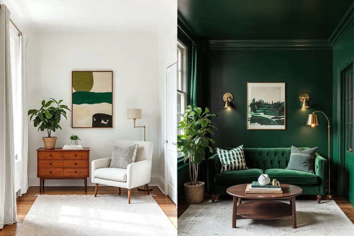
Light vs. Dark Palettes: The Real Comparison
Let’s put the two approaches head to head, because this is where most homeowners get stuck.
Light Palettes
Pros: Reflect light, make ceilings feel taller, create airiness, pair well with almost any furniture color, and are generally more forgiving if you’re not sure what you’re doing. Cons: Can feel cold and clinical without the right layering of textures and warm accents. Bright whites in particular can feel harsh in rooms with lots of natural light.
Dark Palettes
Pros: Create a cozy, enveloping atmosphere; hide imperfections in walls and trim; make a room feel intentionally designed rather than accidentally small. Cons: Require more lighting investment, can feel oppressive if overdone, and demand bolder or more carefully chosen furniture to avoid everything visually disappearing.
The truth? Neither is universally better. The best small living room color ideas always start with your specific room’s conditions — not a generic rule.
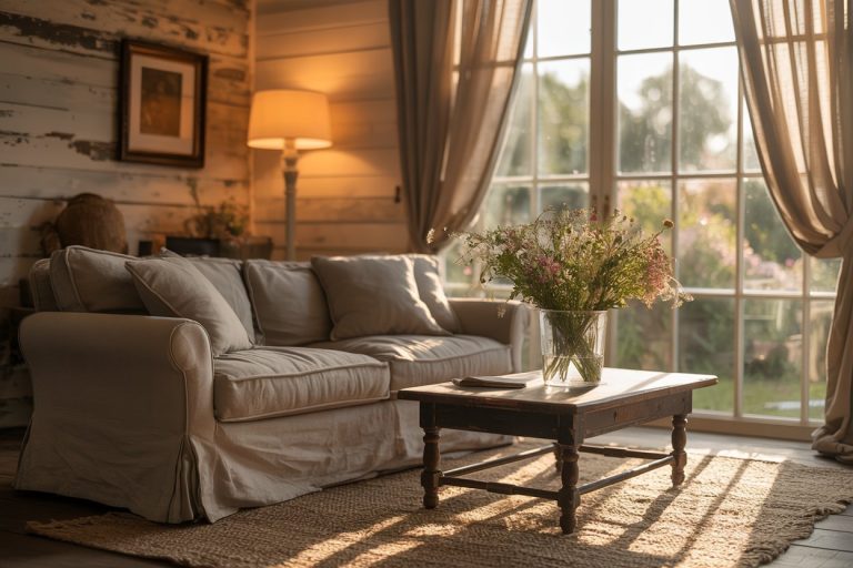
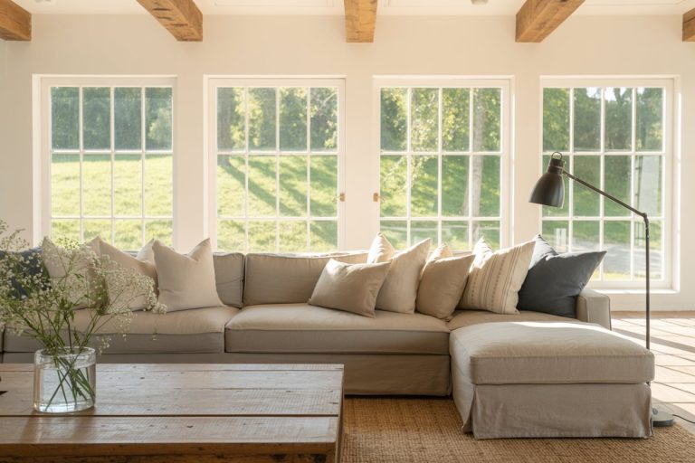
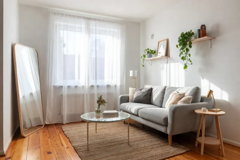
Best Light Colors for Small Living Rooms
If you want to go the lighter route, here are the palettes that perform best in small spaces:
Soft Whites and Off-Whites
Skip the stark bright white (it reads as sterile) and lean into off-whites with warm or barely-there green undertones. These read as clean and bright without looking like a hospital room. Great picks: Benjamin Moore’s White Dove, Sherwin-Williams’ Alabaster, and Farrow & Ball’s All White.
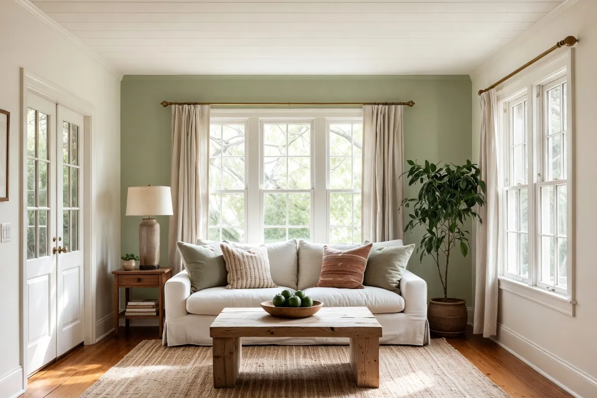
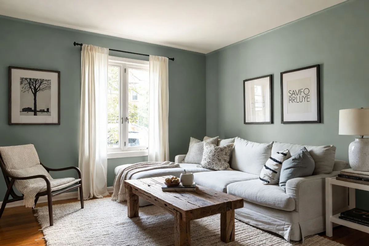
Pale Blues and Greens
Cool, muted blues and sage greens are incredibly popular for a reason — they recede visually, making walls appear further away than they are. They also pair beautifully with natural wood tones and linen furniture, which keeps a small room feeling warm rather than stark. Try Sherwin-Williams’ Comfort Gray or Benjamin Moore’s Pale Oak for a warmer sage vibe.
Warm Greiges and Taupes
Greige (gray + beige) tones are the workhorse of small-space design. They’re neutral enough to expand the room visually while adding enough warmth that the space doesn’t feel sterile. Benjamin Moore’s Revere Pewter is a classic, though it can run warm and muddy in low-light rooms — test it first.
If you’re also rethinking color choices in adjacent spaces, the same logic applies to smaller rooms throughout the home. Our guide on farmhouse bathroom paint colors covers a lot of similar territory for compact spaces.
How to Make Dark Colors Work in a Small Space
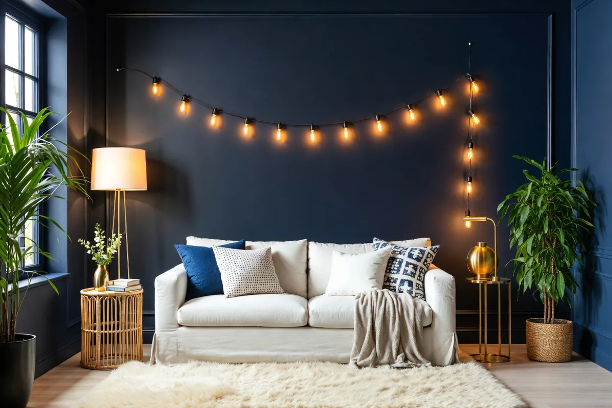
Counterintuitive but true: dark colors can work brilliantly in a small living room when applied with intention. The key is commitment. Half-measures with dark paint look accidentally gloomy. Going all-in looks deliberately dramatic.
Paint everything the same dark tone. Walls, trim, ceiling — all one color. This eliminates the visual borders that make a room feel boxed in. Deep navy, forest green, charcoal, and dusty plum all perform well with this approach.
Layer in natural light sources. Dark rooms need more light, not less. Add floor lamps, uplights, and table lamps to create warmth and prevent the space from feeling like a cave.
Choose furniture with contrast. In a dark room, light-colored or natural-toned furniture becomes the focal point and prevents everything from blending into a visual black hole.
Designers who love this approach often reference how dark colors used in dining rooms and intimate spaces create a sense of luxury and coziness. In fact, the same principles that make dark kitchen backsplash ideas feel luxurious apply beautifully to small living room walls — it’s about creating depth, not just adding darkness.
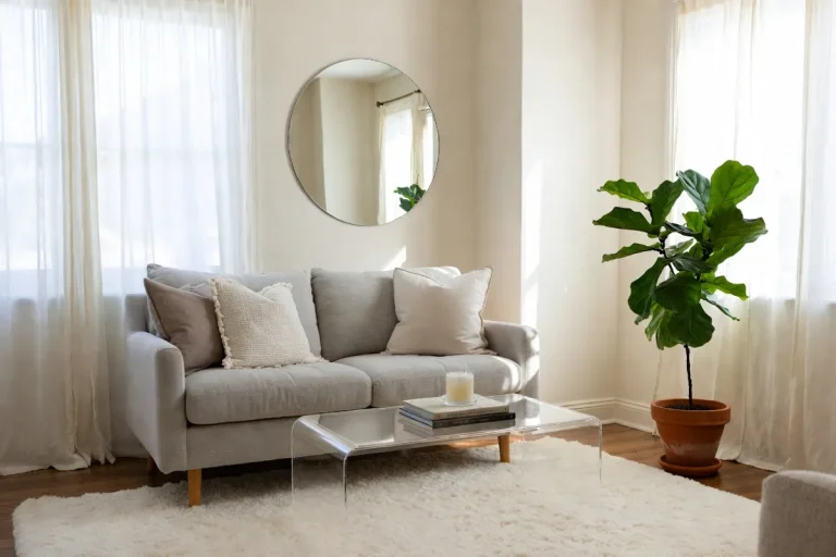
The Monochromatic Trick That Designers Swear By
One of the most underused small living room color ideas is the monochromatic approach — and it’s probably the single most effective technique for making a space feel genuinely larger.
Here’s how it works: instead of choosing one color for your walls and contrasting trim, you paint your walls, ceiling, and trim all the same color (or very close shades of the same family). When there’s no visual break at the baseboard, the crown molding, or the ceiling line, your eye doesn’t register where surfaces stop. The room appears to have no hard edges, which the brain reads as spacious.
Take this further by choosing furniture and soft furnishings in the same color family. A soft sage wall with warm white trim and a cream linen sofa reads as a single, harmonious composition — not a small room with furniture crammed into it.
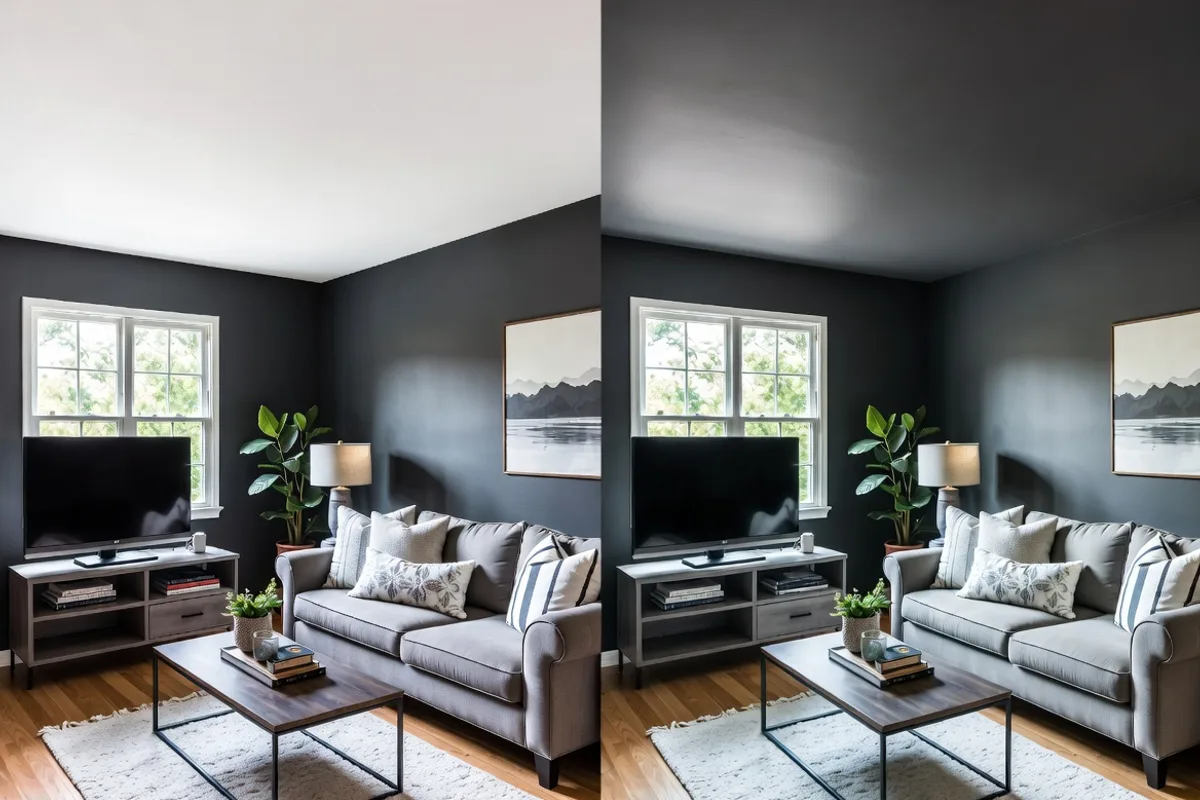
Pro tip: The ceiling is the most neglected surface in small rooms. Paint it the same color as your walls (or one shade lighter) and the room will immediately feel taller.
Why Undertones Matter More Than You Think
This is where most DIY decorators go wrong. You pick a lovely soft gray swatch at the store, bring it home, paint a whole wall, and suddenly it looks purple — or green — or pink. What happened?
Every paint color has undertones: subtle secondary hues hidden within the base color that only reveal themselves once they’re on your walls and reacting to your specific light. A gray with pink undertones will look lavender in cool north-facing light. A white with yellow undertones will look buttery warm in a sun-drenched south-facing room.
How to identify undertones: Hold your paint chip against a pure white piece of paper. The color that seems to pop in comparison to the white IS the undertone.
How to choose the right undertone for your room: North and east-facing rooms (cooler light) benefit from warmer undertones — creams, yellows, taupes — to compensate for the cooler natural light. South and west-facing rooms (warmer light) can handle cooler undertones like blues and greens without them feeling cold.
Paint Brand Recommendations by Color Family
Here are our top picks organized by palette type — all tested by designers in real small living rooms:
For Light and Airy
- Benjamin Moore Chantilly Lace (OC-65) — The cleanest, crispest white with minimal undertone. Works in almost any light.
- Sherwin-Williams Alabaster (SW 7008) — A warm off-white that never feels cold. One of the most popular living room colors in the country for good reason.
- Farrow & Ball Skimming Stone (No. 241) — A warm greige that reads differently at different times of day; endlessly sophisticated.
For Soft and Serene
- Benjamin Moore Sea Salt (2123-40) — A barely-there blue-green that feels spa-like and airy.
- Sherwin-Williams Comfort Gray (SW 6205) — Consistently one of the top-performing small-room colors; warm gray with green undertones.
- Behr Crushed Ice (790C-1) — A budget-friendly pale blue-gray that performs like a premium color.
For Moody and Dramatic
- Farrow & Ball Hague Blue (No. 30) — A rich, deep teal that makes small rooms feel intentionally curated.
- Sherwin-Williams Iron Ore (SW 7069) — A near-black charcoal with warm undertones; stunning in small spaces with good lighting.
- Benjamin Moore Newburyport Blue (HC-155) — A classic navy that sits between bold and subtle.
Common Color Mistakes in Small Living Rooms
Even with the best intentions, these mistakes can undermine your efforts:
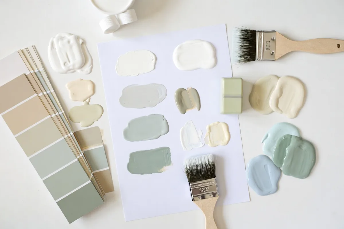
1. Picking color from a tiny chip. A 2-inch swatch is almost useless. Always buy a sample pot and paint at least a 12×12 inch test patch directly on the wall. Observe it at different times of day.
2. Ignoring the ceiling. A bright white ceiling in a dark-walled room creates a jarring boundary that makes the room feel shorter. Match your ceiling tone to your wall family.
3. Too many accent colors. In a small room, every additional color is another visual interruption. Stick to a two or three-tone palette and let texture do the work instead.
4. Choosing flat paint for all surfaces. Flat paint absorbs light, which can make walls recede in a good way — but it also shows scuffs and is hard to clean. Use eggshell or satin on walls for durability, and save matte for ceilings.
5. Forgetting about flooring. Your floor color interacts constantly with your wall color. A warm honey-toned wood floor will fight with cool gray walls. Consider the whole room as a system, not just the walls in isolation.
Frequently Asked Questions
What is the best color to make a small living room look bigger?
Soft, cool-toned neutrals like pale blue-gray, warm white, and sage green consistently perform best for making small living rooms feel more spacious. These colors reflect light and visually push walls outward. That said, a monochromatic approach — painting walls, trim, and ceiling the same hue — is arguably more effective than any specific color choice, because it eliminates visual boundaries entirely.
Can dark colors work in a small living room?
Yes, absolutely — but only if you commit fully. Painting all surfaces (walls, trim, and ceiling) the same dark color eliminates harsh edges and creates an enveloping, intentional atmosphere. Dark rooms need more layered lighting to prevent a cave-like feel. When done correctly, dark small living rooms often feel more sophisticated than their light counterparts.
Should I paint my small living room ceiling white?
Not necessarily. A stark white ceiling in a colored room creates a sharp visual boundary that can actually make ceilings feel lower and rooms feel smaller. For the most expansive feel, paint your ceiling the same color as your walls or one shade lighter. Reserve true white ceilings for rooms where all other surfaces are also light.
How do I test paint colors before committing?
Always purchase a sample pot (most major brands offer 4-oz or 8-oz testers) and paint a large swatch — at least 12×12 inches — directly on the wall. Observe it in morning light, afternoon light, and under artificial evening light. Colors can shift dramatically depending on the time of day and your room’s light sources. Never choose a color based solely on a paint chip under store lighting.
Conclusion
The best small living room color ideas aren’t about following a rigid rulebook — they’re about understanding the principles behind how color, light, and perception interact, then applying them to your specific space. Whether you go soft and airy or bold and moody, the most important thing is to test before you commit, consider the whole room as a system, and don’t underestimate the power of a unified, monochromatic palette.
Remember: undertones, ceiling color, paint sheen, and your room’s natural light all play just as big a role as the color you pick from the chip. Take the time to get those details right, and you’ll end up with a living room that feels genuinely larger — not just painted lighter.
Ready to dive deeper into transforming your home room by room? If you’re also updating your dining space, our roundup of small farmhouse dining room ideas is packed with space-maximizing strategies that pair perfectly with the color techniques above. Now grab those sample pots and start testing — your bigger-feeling living room is just a few coats away.